Pollinator Partnership
Timeline & Time: I worked with a team of five over a three week project
Role: User Researcher, UX/UI Designer
Tools: Figma, Fig-jam, Illustrator
Pollinator Partnership is a nonprofit whose mission is to promote the health of pollinators, critical to food and ecosystems, through conservation, education, and research.
We redesigned the website to help home gardeners easily learn how to make their garden pollinator-friendly.
PROBLEM SPACE
The Pollinator Partnership website is a treasure trove of information and resources about pollinator health, providing a wealth of knowledge for those who are interested in this important issue.
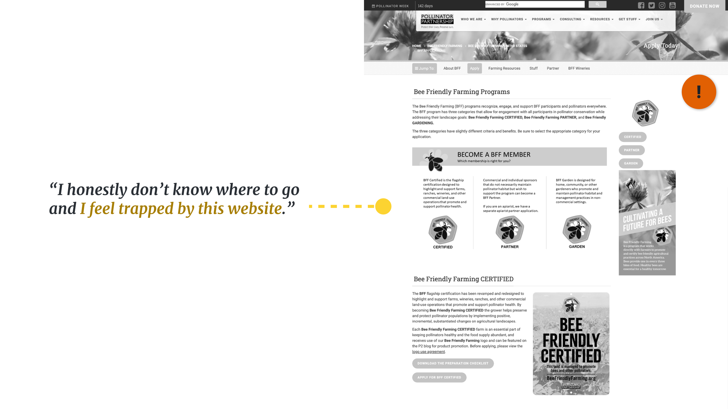
However, the sheer amount of information available on the site can be overwhelming, and the presentation of this information can be intimidating for home gardeners who are looking for practical and accessible information.
THE SOLUTION
1) Organize information into a streamlined process for building a pollinator-friendly home garden.
This process should be easy to follow, with clear and concise steps for creating a garden that supports pollinators
2) Define the certification criteria and benefits of becoming a pollinator-friendly garden, as well as provide a simple and straightforward application process.
This would allow home gardeners quickly and easily understand what it takes to support pollinators in their own backyard, and provide them with the tools and resources they need to create a thriving and sustainable pollinator habitat.
SYNTHESIZE
In order to gain a deeper understanding of the challenges faced by home gardeners in accessing information on pollinator health, I employed a variety of research methods. From conducting surveys and interviews to analyzing user behavior on the current website, every effort was made to gather insightful data and identify pain points.
INTERVIEW AND SURVEY
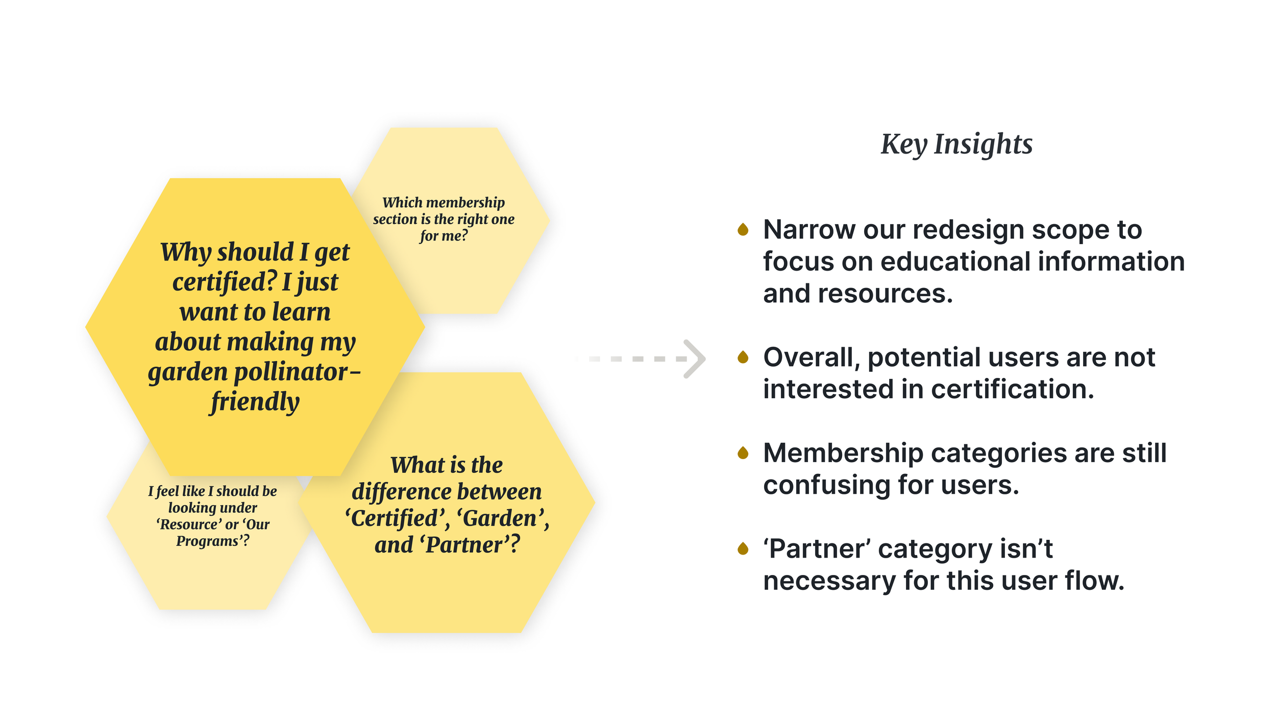
After creating a comprehensive Research Plan, which included interviews with five home gardeners and surveying over 35 individuals, we uncovered a significant challenge in their struggle to find clear and concise information online about pollinator health. Despite this difficulty, our research showed that 94% of people expressed a strong desire to learn more about pollinators. Recognizing this gap, we sought to bridge it by developing a user-friendly platform that provides easy access to practical information. Additionally, our research revealed that home gardeners were often confused by the Pollinator Partnership membership program.
The interview guide can be viewed here.
HEURISTIC EVALUATION
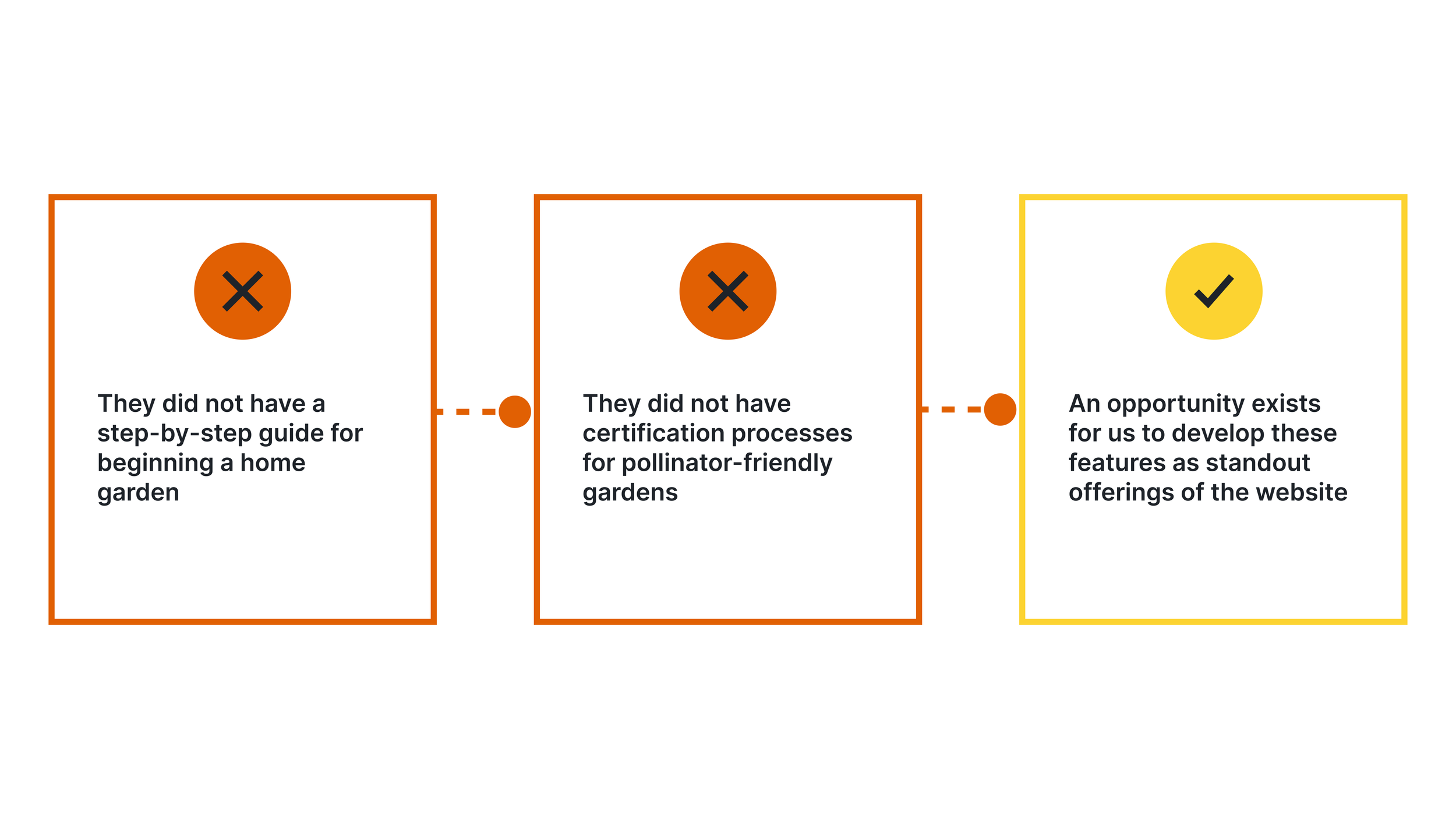
During our Heuristic Evaluation we found a lot of opportunities in that we acted on, but these were the top three:
COMPETITOR ANALYSIS
Lastly, I benchmarked 4 other websites and found they did not have these two things – a step by step guide to adopting new gardening practices and a membership program. We felt this was an opportunity for the Pollinator Partnership organization.
IDEATION
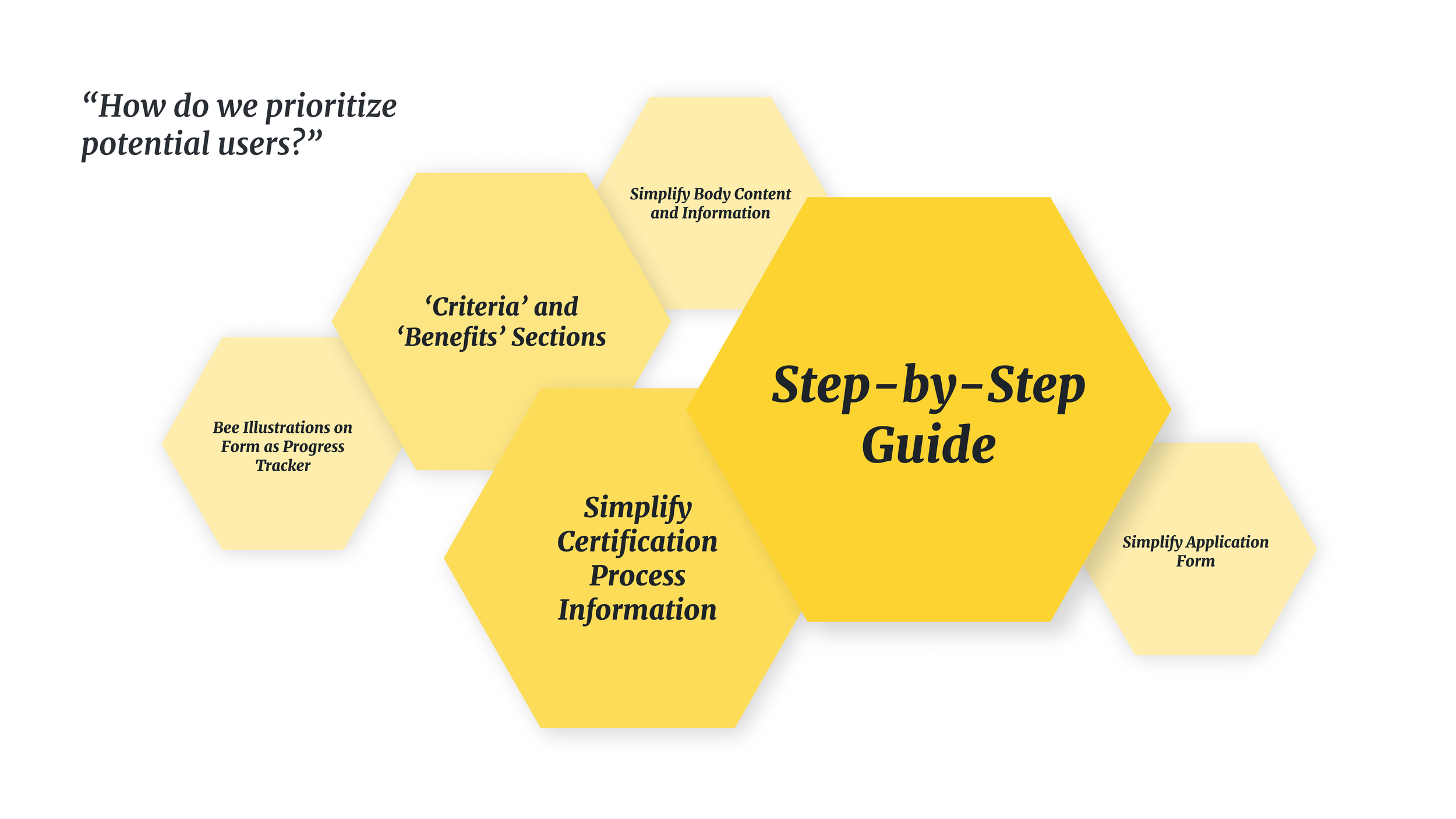
Based on our website analysis, user survey, and user research, I brainstormed some ideas to prioritize the needs of our potential users, and defined what their flow would look like. Here is my workspace.
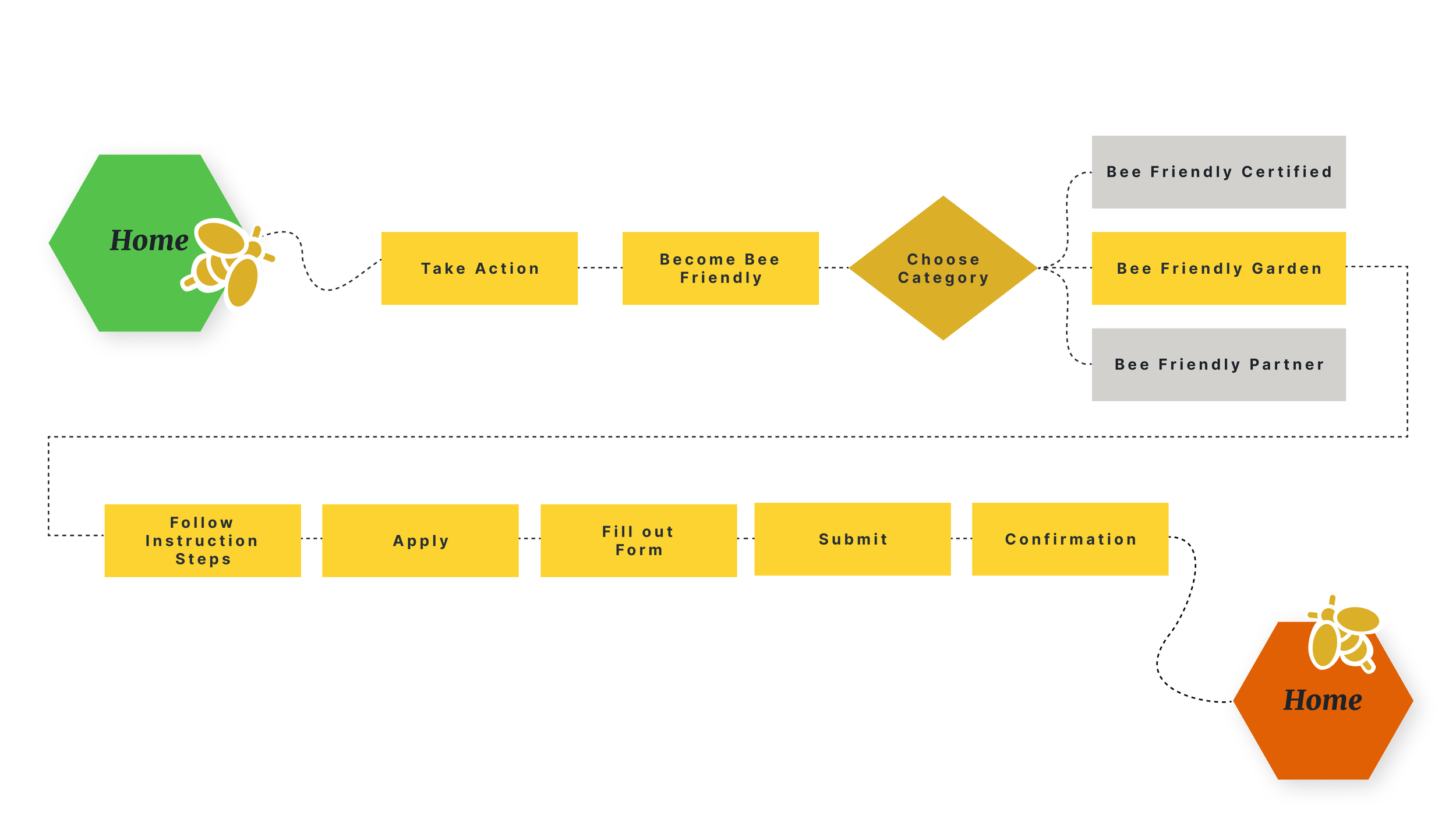
PROPOSED USER FLOW
In this user flow, I redirect our user away from their original source confusion where the difference between the 3 types of certification wasn’t clear.They could now navigate through the process of building a bee-friendly garden and even apply for a garden certification.
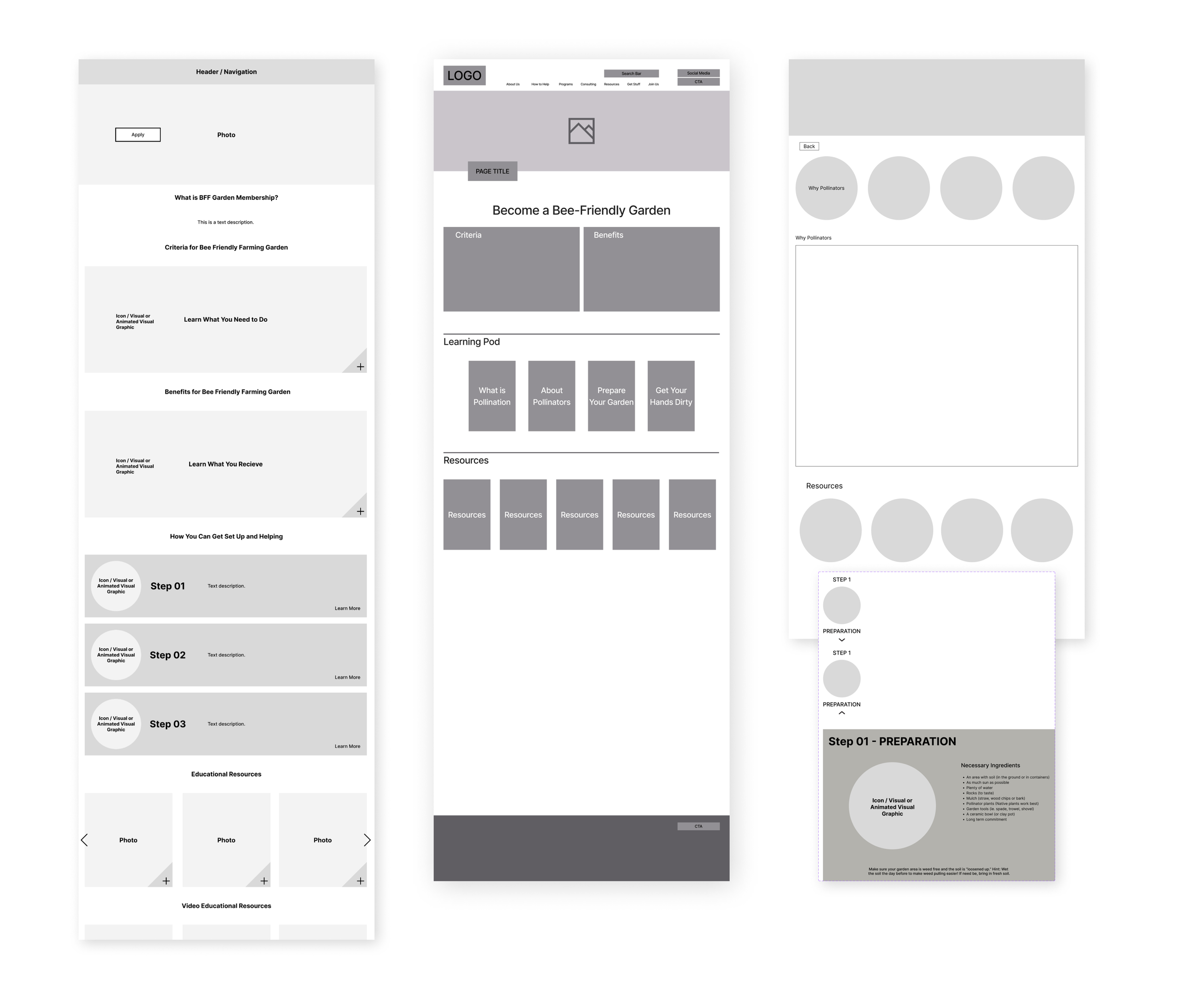
LOW FIDELITY DIGITAL IDEATION
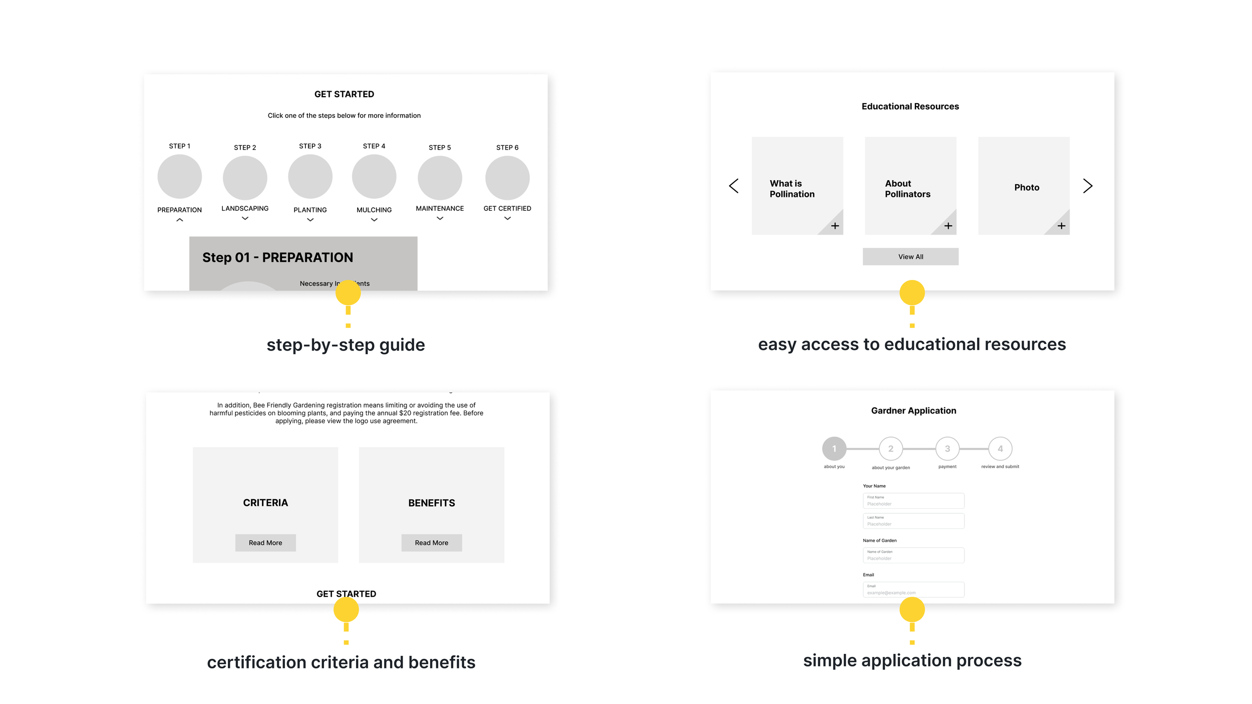
Based on the user flow analysis, we proceeded to build a low-fidelity prototype that addressed the challenges faced by home gardeners in finding clear and concise information about pollinator health. The prototype offered the following features:
Mobile Responsive Version
Desktop Version
After developing our initial prototype, we proceeded to the iteration process. This involved testing the prototype for any issues or flaws, making necessary adjustments, and refining our design further.
We conducted a usability test, which reinforced that we needed to help clarify the different types of memberships and certification, but most importantly we learned that users are more interested in learning about how to build a bee-friendly garden, with the certification being an added bonus. The round one testing can be viewed here.
FIRST ROUND OF TESTING AND INSIGHTS
After testing our low-fidelity prototype and gathering feedback, we moved into building our mid-fidelity prototype.
Our first step was to emphasize learning and information, and minimize the focus on certification. Our original low-fidelity design referenced certification at the top of the page, making users question whether they were in the right place. We went on to center the focus of the page on how to create a bee-friendly garden, putting users at ease.
A/B TEST
We removed the category of ‘Partner’ from our user flow because it focused on financial contribution and wasn’t related to specifically implementing bee-friendly practices. Our A/B test concluded that users prefer a side-by-side layout to best represent the remaining categories of ‘Farming’ and ‘Gardening.’
With our new insights, we now moved into the first version of our mid-fidelity prototype. We then conducted our second round of usability testing. We found that the first place users wanted to look for information was in the ‘Resources’ tab of the primary navigation. We also found that users were struggling with the phrase ‘Become Bee Friendly’ because the verb ‘Become’ is not the first thing that comes to mind while searching.
SECOND ROUND OF TESTING AND INSIGHTS
With our new insights, we now moved into the second version of our mid-fidelity prototype. Our third round of usability testing showed us that users want to look for information under Resources, we added ‘Bee Friendly Practices’ as an option. ‘Take Action’ changed to ‘How to Help’ in hopes it may encourage users to check in that tab rather than ‘Resources’. ‘Become Bee Friendly’ changed to a more literal phrase: ‘Build Your Home Garden’
THIRD ROUND OF TESTING AND INSIGHTS
ONE CLICK TEST
With our updated prototype, we conducted a one click test which further validated that people want to look for information in resources.
PROTOTYPING
After completing one concept wireframe, three mid-fidelity prototypes, and three rounds of user testing we’re ready to move into High-fidelity prototyping.
WHAT’S NEXT
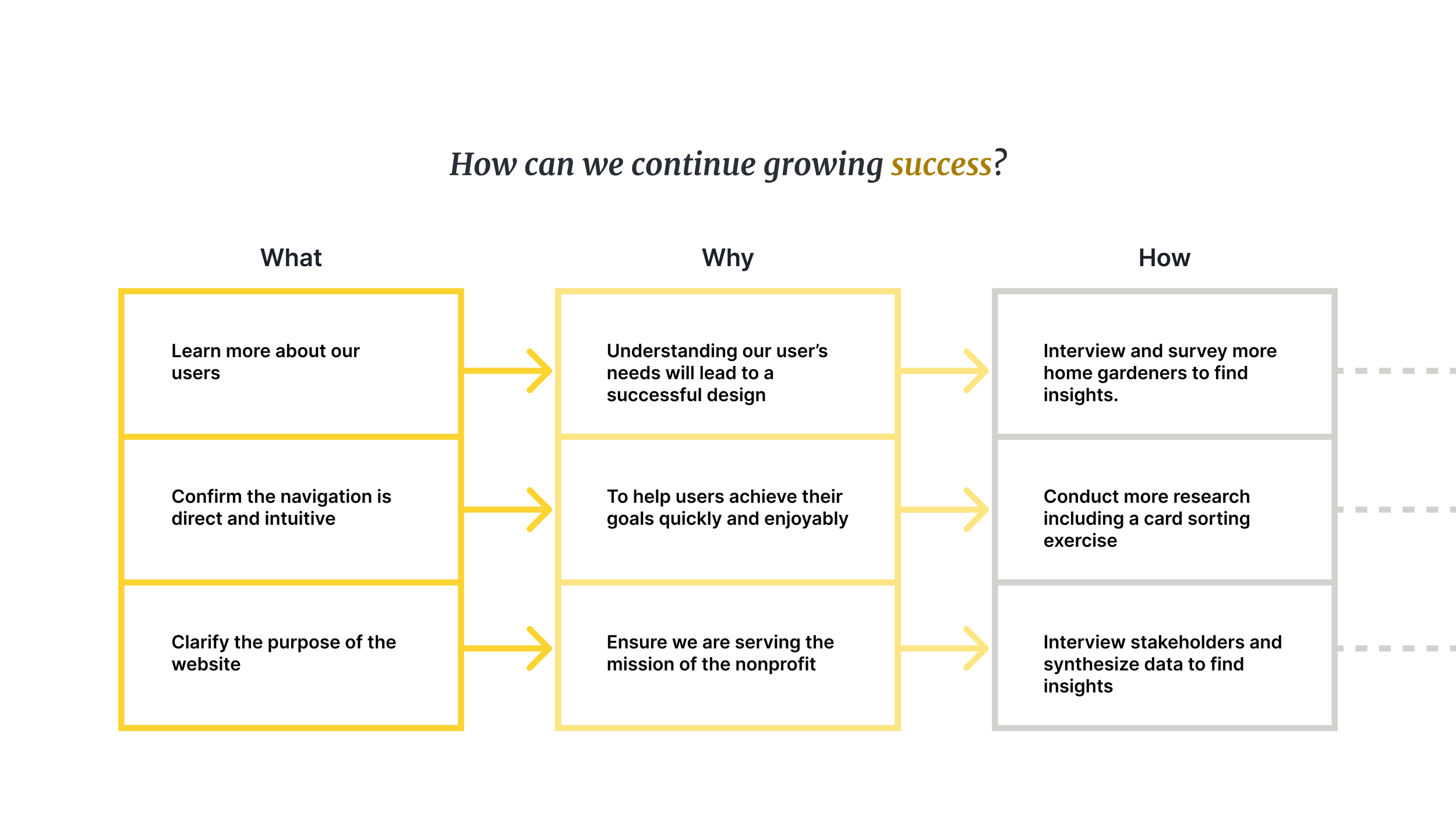
We achieved key successes. And, we also found that there is still much more we want to do. We identified three strategies to help going forward:
Our Team found that these simple changes to a single user flow could have drastic impact the success of this nonprofit.
Think of this as a seed from which opportunity can grow.
Here is the full Case Study.

